
THE NATURE OF GLASS. In most cases glass is a transparent material. To see colors in glass, a source of light must be passing thru the object. In the absence of light, there'd be no visible color. The type of light (whether natural, incandescent, fluorescent, or other), its orientation (front, back, top, bottom, side, combination), and it's brightness will all determine the appearance of colors. Positioning of the glassware item makes a difference, since a jar or bottle placed on a display shelf against a solid white wall, will appear darker and more richly colored than the same jar displayed with back lighting, or placed in a sunny window. For a glassware item sitting on a wall shelf, the brightness behind the item is reduced by the item's proximity to the wall.....that is, we're looking thru the object and into its shadow. The same bottle or jar, when moved away from the wall, placed in a window, or held to a light, seems lighter-colored in appearance. The following photos demonstrate these effects. Click on each photo for a larger annotated version.
SHADOWS and LIGHT. In each of the above images, the jar on the left has been placed in the middle of a table, away from any walls, with average indoor room lighting, and with a solid, near-white background. There are no shadows to influence the appearance of the color in this case. In contrast, the center views depict the same jar, but placed with its back against a white wall. This is a common display scenario used by many collectors, with their jars displayed on a wall shelf. In this case, the jar casts a shadow onto the wall directly behind it, making the color look darker. In the images on the right side, we have a window display. In this case, the back lighting greatly exceeds the front lighting. This causes the thinner areas of the jar to look lighter or 'wash out'. The thicker areas of glass, such as the base and mouth regions, contrast darkly, due to less light passing thru these areas. In spite of this washing-out effect, jars and bottles shown in a window do seem to better display their character and embossing, and also have more of a sparkling appearance in the bright, natural light. Note that all of these images were taken without the use of photo flash. GLASSWARE PHOTOGRAPHS. The growth of internet sales brings collectors a handy resource for building a collection. We now have instant access to more items than we could have found in years of hunting thru antique stores, flea markets, bottle shows, estate auctions, and etc. However, in most cases we are shopping for these items based mainly on a digital image of the item displayed on our computer screen. So understanding the way photos are taken and processed may help in making purchase decisions. When viewing images of jars and bottles on the internet, always consider how the item is being displayed in the photo, before deciding about the color. Is the photo taken outside or indoors?... What is the background coloring and content?....Is the item sitting on a wall shelf or out in the open?...Was flash used?....Was the lighting dim or bright?.....etc. Note that the use of camera flash can be helpful in properly illuminating the bottle or jar, but can also have an effect of 'darkening' glass color, in that a dark shadow is cast behind the item by the flash. You might see the shadow in the photo, and forget that you are looking at a shadow behind the item, and not just the glass itself. A comparative image, displaying the bottle or jar next to a 'known' standard colored example can also be helpful. Of course this all assumes that photos will have been taken against a white or near-white background. Use of a strongly colored background will make photos of colored glassware items nearly useless for evaluating color. Further, both the mis-adjustment of camera settings and/or the mis-use of photo processing software allows dramatic altering of colors. However, any drastic color alterations will usually be apparent. If you suspect digital color alteration may have been done, look carefully at background items, or the metal closure parts for any unnatural color appearance. A little experience and you should be able to detect these un-natural looking images. COLOR NAMING. Many strong colors are unmistakable and easily recognizable, almost no matter what the lighting situation. The terms 'cobalt blue', 'black glass', 'deep amber', 'purple', etc, usually don't cause much confusion. But the more subtle color tones such as pale blues, yellows and pale greens, and the varied tones of amber glass, often challenge verbal description. We will use terminology that has been most commonly adopted by the fruit jar hobby. There's no "governing authority" on colors, so keep in mind these photos and notes are simply the color names that we use, as do many current collectors. ORIGIN of COLOR NAMES. Several glass colors were named from other transparent materials such as jewels or gemstones (Emerald, Aquamarine, Amber, Sapphire). Where there was no appropriate gem to describe a color, it seems that hobbyists adopted color names from fruits, flowers, or plant parts (Citron, Lime, Apple, Cornflower, Olive, Puce), and natural materials/minerals (Cobalt). YOUR COMPUTER. To communicate about glass colors when we're unable to hold the item in our hands, we often rely on digital images. Bear in mind that most color monitors have adjustable color and brightness settings. If your monitor is improperly set, you could have a problem. Various operating systems and graphics applications can have variable color settings as well. This is rarely an issue, but worth keeping in mind.
AQUAMARINE The title of "aquamarine", from the gemstone, describes a pale blueish green tinted glass color. This color is the "natural" color of glass, and is the typical color for the vast majority of all early fruit jars. Here's a shot displaying aquamarine colored jars. This shot also demonstrates the stark contrast between true blue and aquamarine. In this photo, we also show a pair of jars in the color commonly referred to as "Ball Blue". This color could also be termed as light blue-green. The title of "Ball Blue" originated with the jar production of the Ball Bros Glass Mfg Co in Muncie, Indiana, most of which came out in this deeper shade of aqua. This richer shade of color apparently resulted from a special source of sand that they used in the production of their glass.
TRUE BLUE COLORS The term "Cobalt Blue" is used to describe a pure blue, that is technically speaking, the "base color" blue, with no "base yellow" in it, and thus no green tone. There are other names used in glass collecting to describe strong blues......"sapphire blue", "peacock blue", "cornflower blue", "sky blue", and perhaps others. It is important to realize that pure "blue" in the fruit jar and bottle hobbies, carries significant meaning. A common mistake is the reference to the color of aquamarine, the natural color of glass, as "blue". This can lead to problems and mis-understandings. Once you have seen a true blue colored glass item, you will never again mistake this beautiful and rare color. SHADES OF AMBER The color name "Amber" derives from the gemstone, which is basically a fossilized tree sap. Amber is an orangish-brown color used to describe glass color with many adjectives added. Lighter amber colored jars and bottles are sometimes improperly called "yellow". The simple visual test we use for discerning true yellow, is that it has none of the orange tint of amber. Look for noticeable amber (orange) tones in the thicker parts of the glass such as the base and lip areas. Here we depict a few true yellow jars (Globes) alongside some of the many shades of amber.
WHAT IS CITRON?? The color name "citron", while readily identifiable to most collectors, seems to cause confusion occasionally. Citron looks like it's namesake fruit, and could be described as a pale yellowish green with a slight golden cast, containing no amber (orange) tone. It is sometimes confused with yellow olive, yellowish apple green, lime green, or olive amber. These colors have either too much amber and/or green tone to be a "true" citron. This color in glass seems to "glow" and is a highly appealing and seldom-seen coloration.
SOME MORE GREENS Another shot showing some various light and medium greens. The first jar is "Apple Green", which is about the lightest shade of yellow-green that is considered as a desirable color by collectors. This term is occasionally used incorrectly to describe a light greenish aqua. We liken this color to that of a "Granny Smith" apple. There is no hint of blue in this color.
THE STRONG GREENS The various shades of deep greens are among the most coveted colors in bottle and jar collecting. Here is a shot depicting a few examples in some of these attractive colors. These dark colors seem to be a mixture of deep greens and blues. The color we call 'Emerald Green' is sometimes referred to as 7-Up bottle green, which provides a familiar reference. The pair of "Emerald Green" quarts depicted above are actually slightly off to the blue side of a pure Emerald Green. About the only absolute '7-up green' found in fruit jars are the Flaccus pints and the Safety Valve jars.
OLIVE GREENS. Olive greens can be broken into several different shades.....like straight 'Olive Green' (light, medium, and dark), 'yellow Olive', 'olive Yellow', 'olive Amber', 'amber-tinted Olive', and maybe others. For these dual-named colors, the first word in the color name serves as an adjective and the second word is the main color name. So 'yellow Olive' means an Olive green colored jar with some yellow tone. Conversely, 'olive Yellow' means we are discussing a Yellow jar which has a little olive green tone to it. The Olive Green color classification is prone to confusion, because there are so many shades. Best way to understand these color names is by viewing a comparison shot showing several of the colors. Of course there are infinite possibilities for shades lying in between those shown. Note: Many other colors exist in historical glass, seen in early bottles, pressed and blown glass. Other ranges of colors such as "puce", "topaz", "ginger ale", and etc are names in common use, but not covered here. These colors are rarely seen in historical fruit jars. 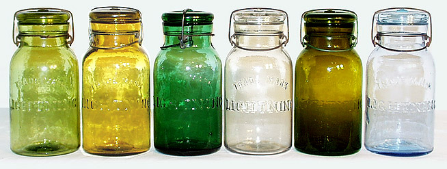 --NAG Auctions-- Main Page-- Contact Us-- Copyright by North American Glass. The contents of this web page and all images contained herein are copyrighted by North American Glass. None of the content of this page may be reproduced, published, or transmitted in any way without prior written consent. |


